The challenge
How to Find a Care Home is a free advisory service that helps UK families find the right care for an elderly relative, with real advisors available seven days a week. Its visitors are often stressed, often older, and often searching late at night. The old website had grown up on a page builder and was slow to change, hard to read on a phone and carried the cost of a platform the business did not need.
The brief was simple to say and hard to do well: get a worried person to a phone call or a message with an advisor as quickly and calmly as possible, on any device, and make the site cheap and safe to run for years.
The approach
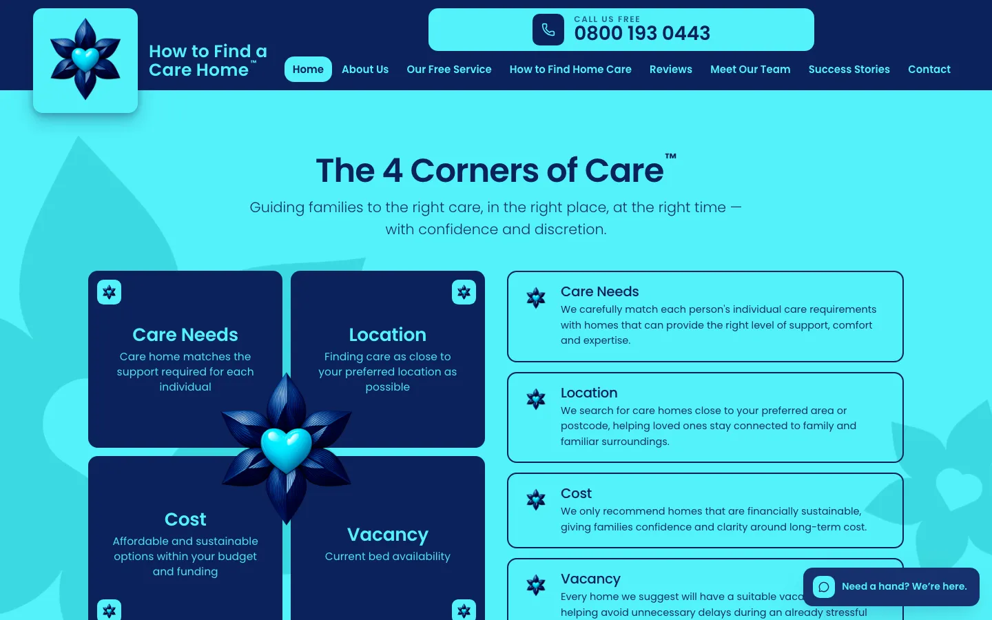
We designed the site around three jobs: reassure, explain, connect. Every page keeps the free phone line in reach, the “4 Corners of Care” idea explains the service in one picture, and the family stories are told with each family’s permission rather than as marketing.
Technically, the site is a static build with no database and no page builder. Pages are generated ahead of time, so there is nothing to slow down, break or patch. The two forms post to small serverless functions that send email through Azure’s email service, with a bot check on the server. Analytics load only after someone agrees to them.
What we built
- A public site with the service explained, home care as a separate path, reviews, the team, family stories, a contact page, a partner page for care providers and a careers page.
- Two enquiry forms that reach the advisors by email, checked for bots on the server, with no third-party form service in the middle.
- A small careers admin behind a sign-in, so the team can post and remove roles without a developer.
- Structured data for the organisation and its reviews, and permanent redirects from every old address so nothing the service had earned in search was lost.
- Hosting on Azure, built and deployed from source on every change, at very low running cost.
The details
The flower in the logo became the system’s motif: it hangs below the navy header, appears as a watermark with a cut-out heart, and shapes the “4 Corners of Care” diagram. One typeface, four colours, no white backgrounds, large text, and a persistent “Call us free” tab for the people who want a human rather than a form.
The outcome
The new site went live in the summer of 2026, replacing the page-builder site with one the service owns outright and that costs very little to run. The service’s own reviews, stories and accreditations stay where they belong: on their site, in their words.
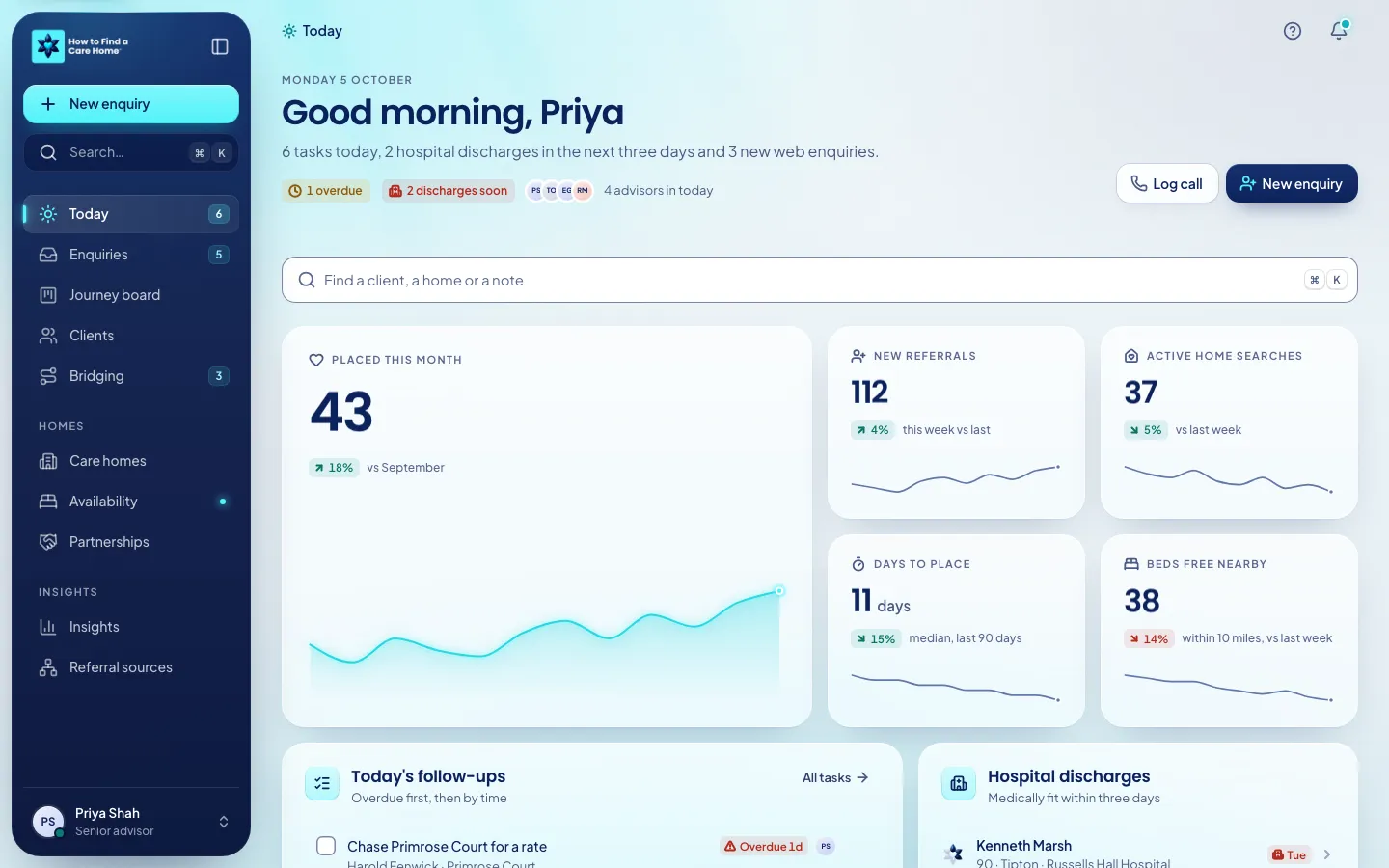
We are also designing the service’s placement CRM, which has its own case study.